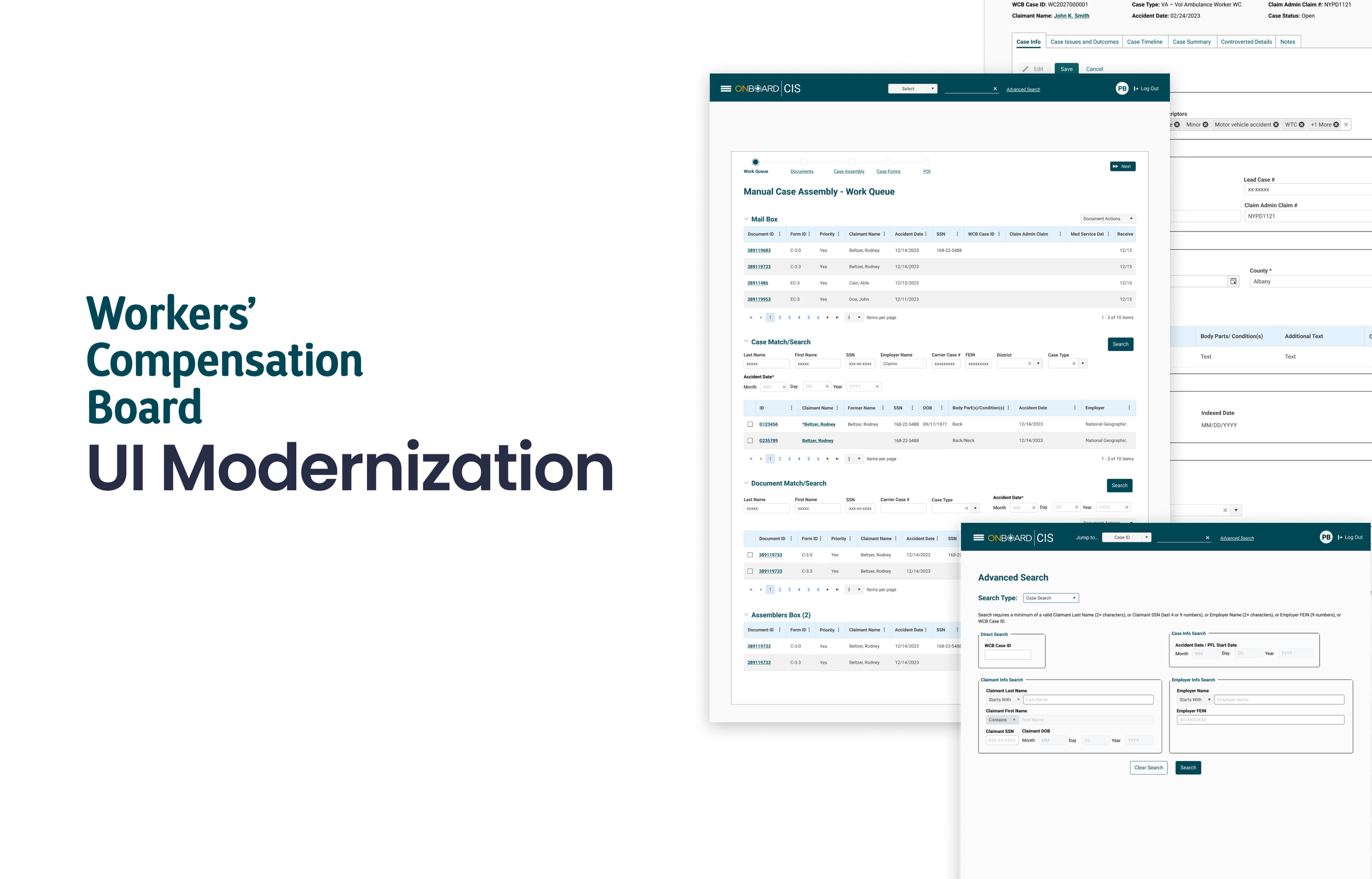
PROBLEM
New York Workers' Comp's legacy CIS platform hadn't been updated in years, resulting in dense screens, inconsistent patterns, and inefficient workflows. Critical areas like case search, manual case assembly, and document management were slow and error-prone, and the previous design team left without reusable UI assets. The challenge was to modernize fast, while rebuilding the foundations.
SOLUTION
As lead UX/UI designer, I rebuilt the design system from scratch, color, type, components, and interaction patterns, then led the end-to-end redesign of core flows, case details, claimant and injury info, advanced search, work queues, document matching and management. Focused on hierarchy, scanability, and clear states. Delivered high fidelity specs and documentation to speed dev handoff and ensure consistency.
REBUILDING THE DESIGN FOUNDATION
1. Auditing the Existing Experience
We began by reviewing the existing CIS experience and the redesign work completed by the previous design team. While stakeholders had references to the proposed experience, we quickly discovered that the original design files, components, and supporting design system were no longer available.
We conducted a deeper audit across existing Framer projects, documentation, screenshots, and other internal resources to determine what could be recovered. Ultimately, we confirmed that the editable source files were no longer accessible.
2. Identifying the Design-System Gap
Without the original source files, there was no reusable component library or established design system for us to continue building from. This created a significant challenge: the organization wanted to preserve much of the direction of the previous redesign, but our team had no underlying UI foundation to work with.
At the same time, we were working against an aggressive delivery timeline, so rebuilding every element independently was neither scalable nor efficient.
3. Establishing a New Foundation
Rather than recreating individual screens without a system behind them, we used Material Design as a foundational reference and adapted it to the needs of CIS.
This gave us a proven starting point for common interface patterns while allowing us to establish our own typography, spacing, components, states, and visual hierarchy for the platform.
4. Reconstructing the Previous Designs
Using screenshots and available documentation as visual references, we reverse-engineered key screens and workflows from the previous team's work.
Our goal wasn't simply to reproduce the screenshots pixel for pixel. We identified the underlying patterns behind them, converted those patterns into reusable components, and used those components to reconstruct the experience consistently.
5. Improving While Rebuilding
Recreating the interface also gave us an opportunity to address inconsistencies and usability issues we encountered along the way.
We refined information hierarchy, spacing, component behavior, interaction states, and data presentation—particularly across complex, information-heavy experiences such as case details, search, work queues, document matching, and manual case assembly.
6. Creating a Scalable UI System
What began as a recovery effort ultimately became the foundation for a more scalable CIS experience.
Instead of leaving behind another collection of disconnected screens, we established reusable UI patterns and components that could support both the immediate redesign and future workflows. This allowed the team to move quickly while creating greater consistency between design and development.
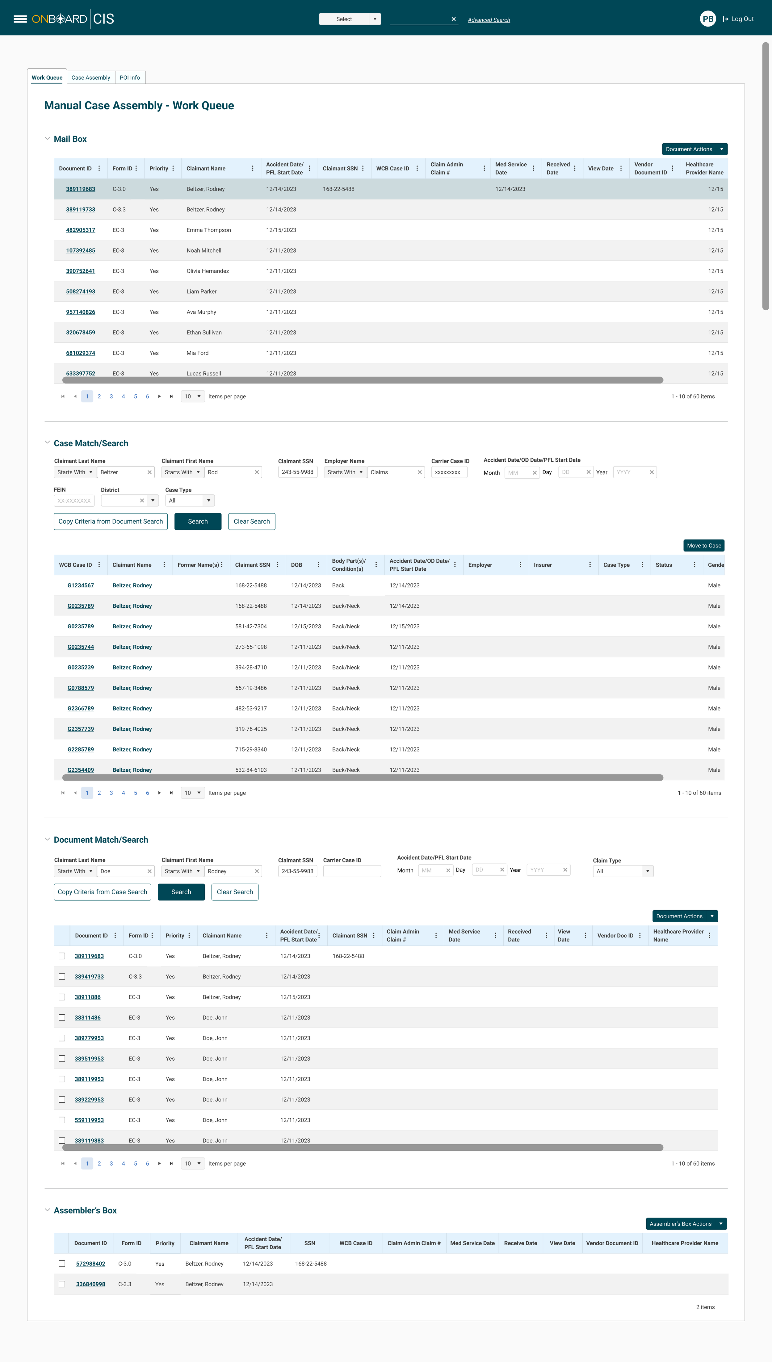
Manual Case Assembly: Managing Complex Workflows in One Workspace
The Manual Case Assembly interface brings several related tasks into a single workspace, allowing users to review incoming documents, search for matching cases, locate related documents, and prepare selected items for case assembly.
Because the workflow contains multiple large datasets and actions, the UI uses clearly separated sections, consistent table patterns, and repeatable search controls to help users understand where they are in the process. Each section follows the same visual language, reducing the need to relearn controls as users move through the workflow.
Data tables prioritize important case and document attributes while using consistent column structures, linked identifiers, row selection, pagination, and action menus to support high-volume work.
Search criteria are positioned directly above their corresponding results, creating a clear relationship between input and output. Actions such as Copy Criteria, Search, Move to Case, and Document Actions are visually differentiated from the underlying data, helping users understand what can be acted upon.
The collapsible sections also allow a complex workflow to remain within one workspace while giving users greater control over how much information is visible at a time.
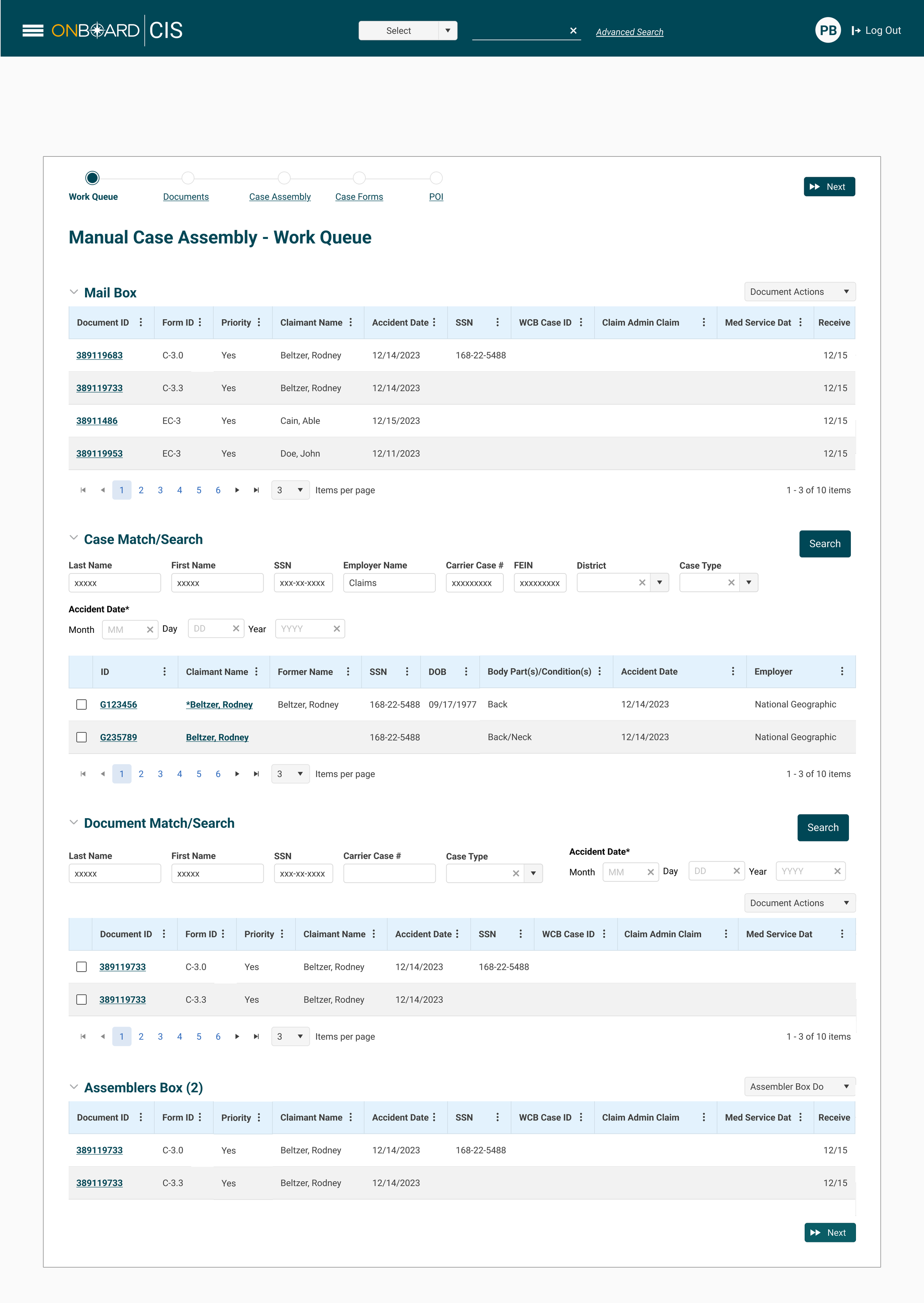
This variation organizes the Manual Case Assembly experience around a clear, step-based progression. The navigation at the top—Work Queue, Documents, Case Assembly, Case Forms, and POI—gives users visibility into both their current location and the remaining stages of the assembly process.
Within the Work Queue, related tasks are separated into distinct sections for Mail Box, Case Match/Search, Document Match/Search, and Assemblers Box. Consistent spacing, typography, search patterns, tables, and action controls create a repeatable visual language across each section.
The design uses progressive structure to manage a large amount of information without removing the complexity users need to perform their work. Search controls are placed directly above their corresponding results, selectable rows communicate available actions, and the Assemblers Box provides a clear destination for documents selected during the matching process.
Key UI decisions
01 — Visible Workflow Progression
The step navigation provides stronger orientation, showing users where they are in the assembly process and what comes next.
02 — Clear Content Hierarchy
Section headings, whitespace, table headers, and consistent alignment visually separate each task while maintaining continuity across the page.
03 — Consistent Interaction Patterns
Search fields, dropdowns, checkboxes, pagination, links, and action menus behave consistently throughout the experience, reducing visual and interaction complexity.
04 — Selection and Staging
Case and document results use selectable rows, while the Assemblers Box acts as a staging area where selected items can be reviewed before users continue.
05 — Progressive Actions
Primary actions such as Search and Next are visually differentiated from secondary controls, helping establish a clearer action hierarchy.
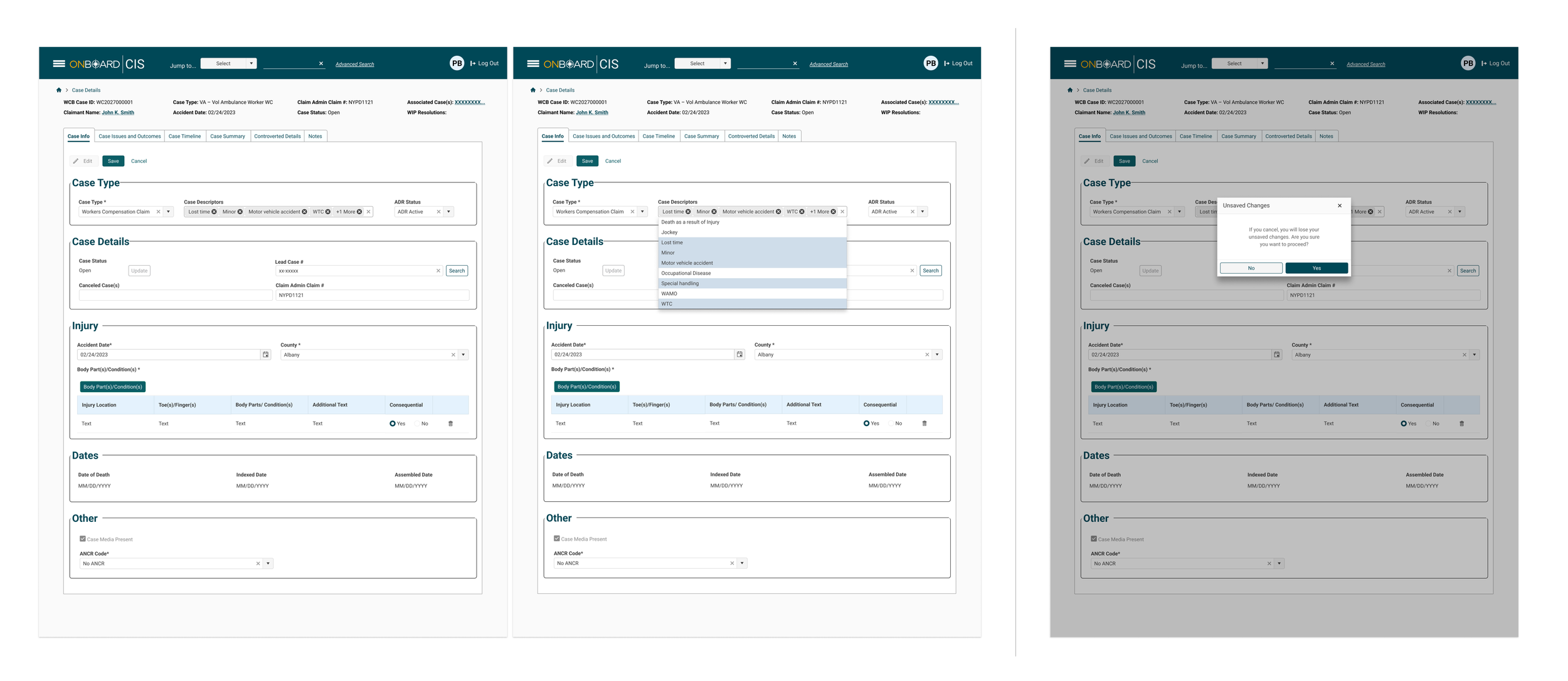
Case Information: Designing Clear Interaction States
The Case Information experience was designed to support users as they review and update detailed case records. Because the interface contains a high volume of information, I established a consistent visual hierarchy that separates content into recognizable sections while maintaining predictable form and interaction patterns throughout the page.
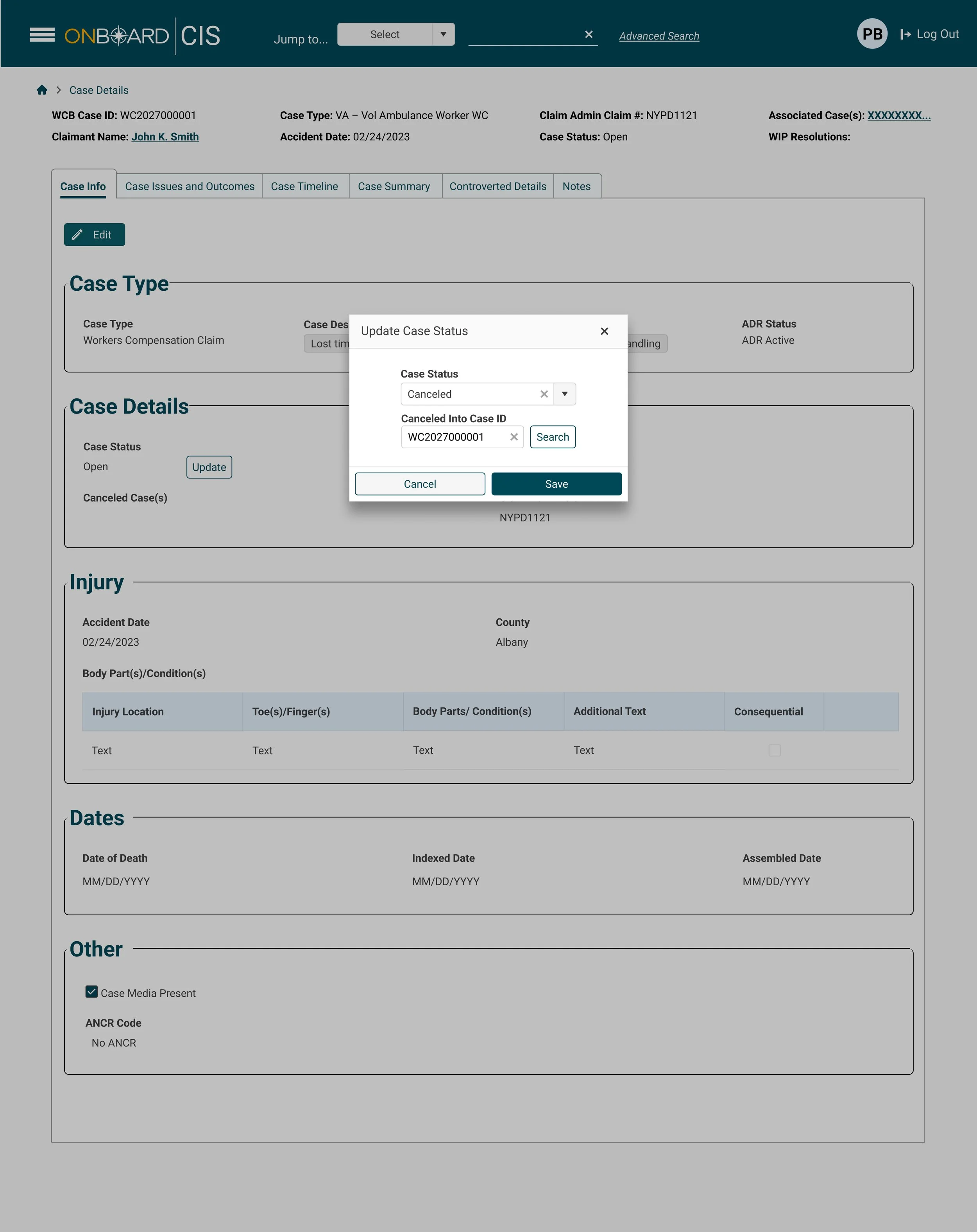
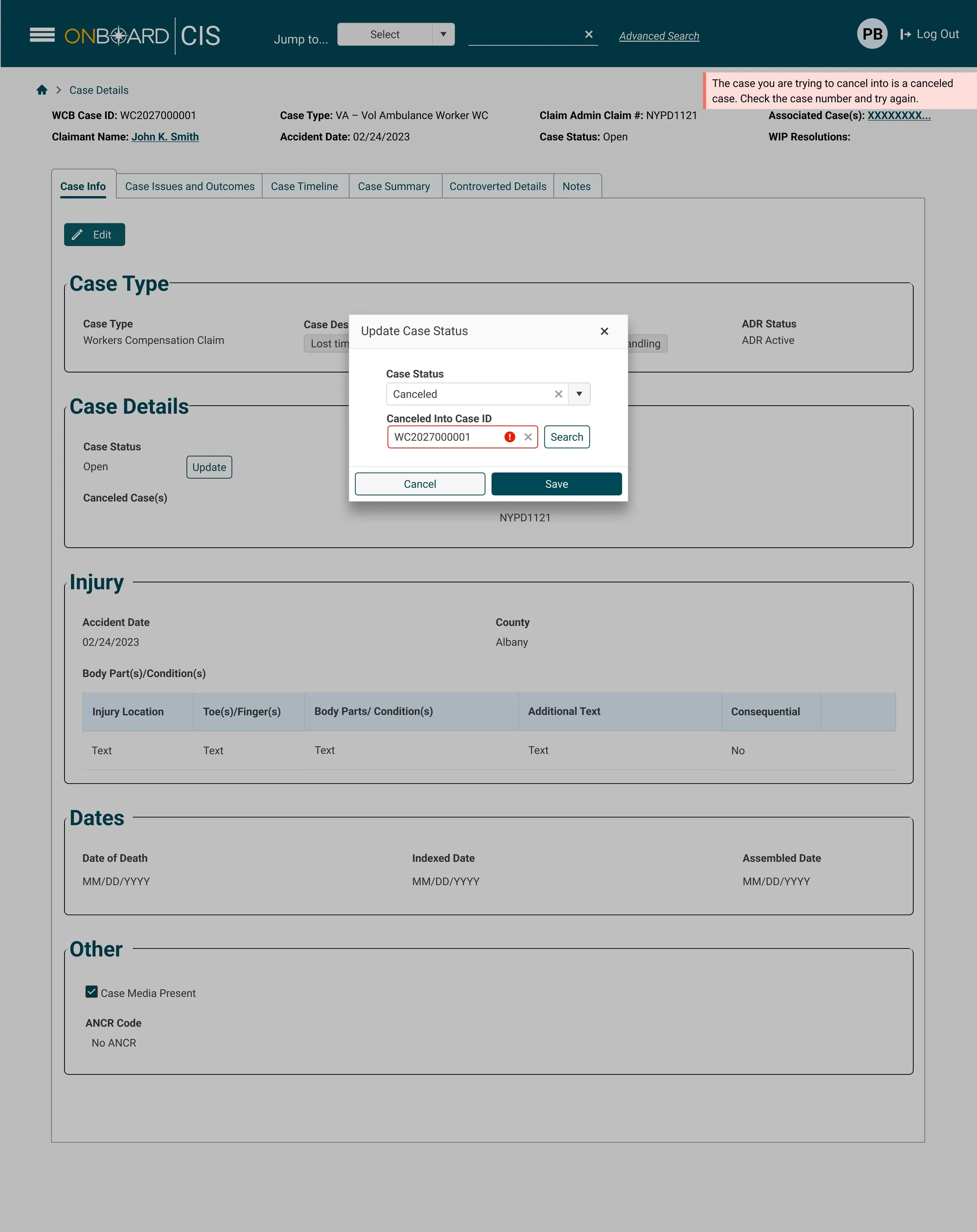
The design also considers how the interface changes as users interact with it—from the initial editing state, to making selections, to receiving feedback when an action could result in lost work.
Key UI decisions
01 — Clear Editing States
Edit, Save, and Cancel controls establish a clear distinction between viewing information and actively modifying a case. Form components use consistent styling and alignment so editable information can be quickly recognized.
02 — Managing Complex Selections
Multi-select components allow users to assign multiple case descriptors while keeping those selections visible within the field. Dropdown states provide immediate access to available options without removing users from the context of the case.
03 — Consistent Component Behavior
Inputs, dropdowns, multi-selects, buttons, tables, radio controls, and date fields follow a shared visual language. This creates predictable behaviors across a form containing several different types of data entry.
04 — Protecting User Changes
The unsaved-changes modal introduces a deliberate interruption when users attempt to leave after modifying information. The focused modal, background overlay, and clearly differentiated actions draw attention to the decision and help prevent accidental data loss.
05 — Maintaining Context
Even when the confirmation modal appears, the underlying Case Information screen remains visible. This preserves context while directing attention toward the immediate decision.
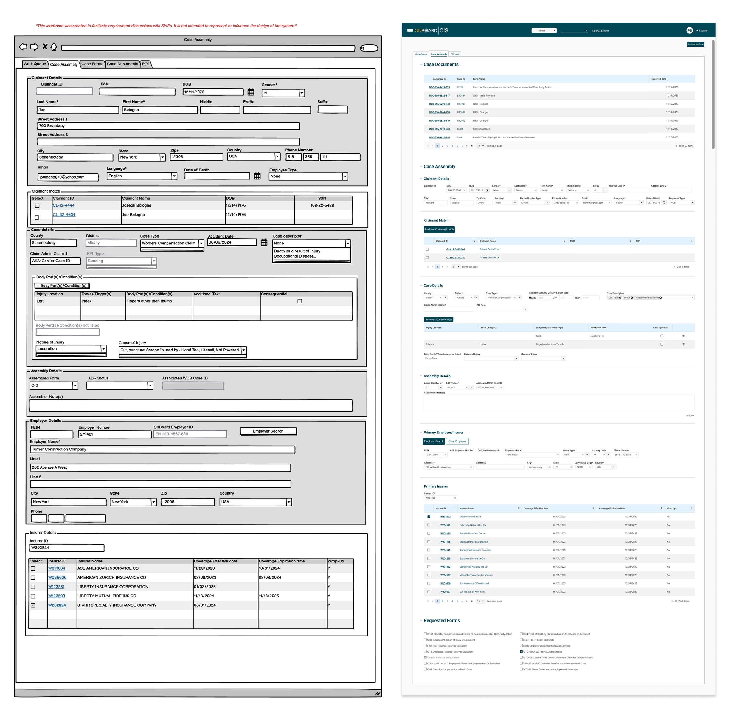
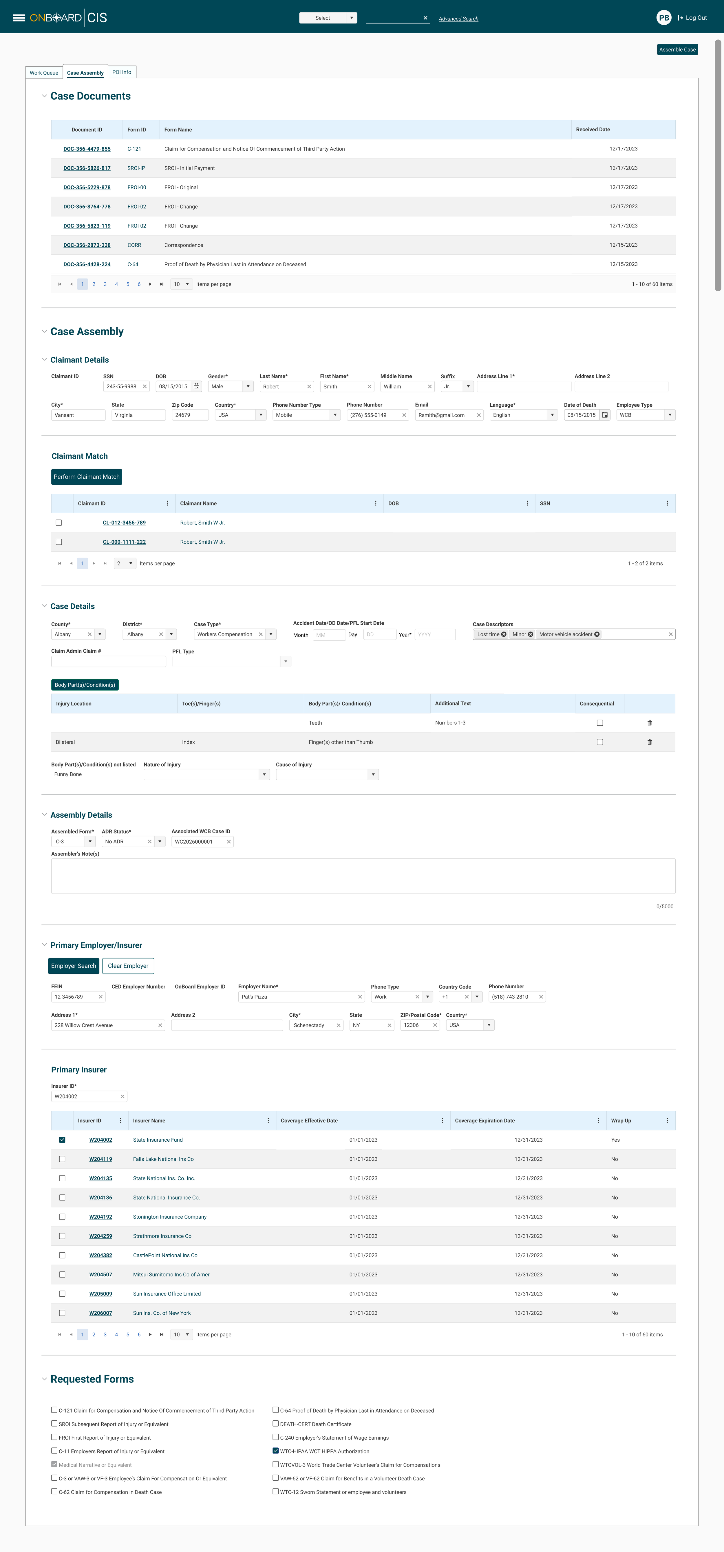
Case Assembly: From Requirements to a Structured UI
The Case Assembly experience began with a requirements-focused wireframe used to capture the large amount of information and functionality needed within the workflow. The challenge was translating that dense specification into an interface that felt structured, consistent, and manageable without removing the information users needed to complete a case.
In the refined design, I introduced stronger hierarchy, more consistent components, increased whitespace, and clearer separation between related tasks. Instead of presenting the experience as one continuous form, the interface is organized into distinct sections for Case Documents, Claimant Details, Claimant Match, Case Details, Assembly Details, Employer/Insurer information, and Requested Forms.
Key UI decisions
01 — Translating Requirements into Visual Hierarchy
The original wireframe prioritized capturing requirements, resulting in a dense collection of fields and tables. The final UI uses typography, spacing, section dividers, and consistent alignment to establish hierarchy and make the same complex information easier to navigate.
02 — Reducing Visual Density
Additional whitespace and simplified containers give individual sections more room to breathe. This creates clearer separation between tasks without removing necessary case information.
03 — Standardizing Components
Fields, dropdowns, tables, checkboxes, pagination, buttons, and selection controls were brought into a shared visual system. This replaces the varied treatments visible in the requirements wireframe with more predictable UI patterns.
04 — Separating Tasks Within a Long Workflow
Claimant matching, case details, employer information, insurer selection, and forms are visually separated into recognizable sections, allowing users to focus on one part of the assembly process at a time.
05 — Improving Data Relationships
Related inputs and their results are positioned together. For example, claimant information leads into claimant matching, while insurer information is paired with selectable insurer results. This makes relationships between controls and data visually clearer.
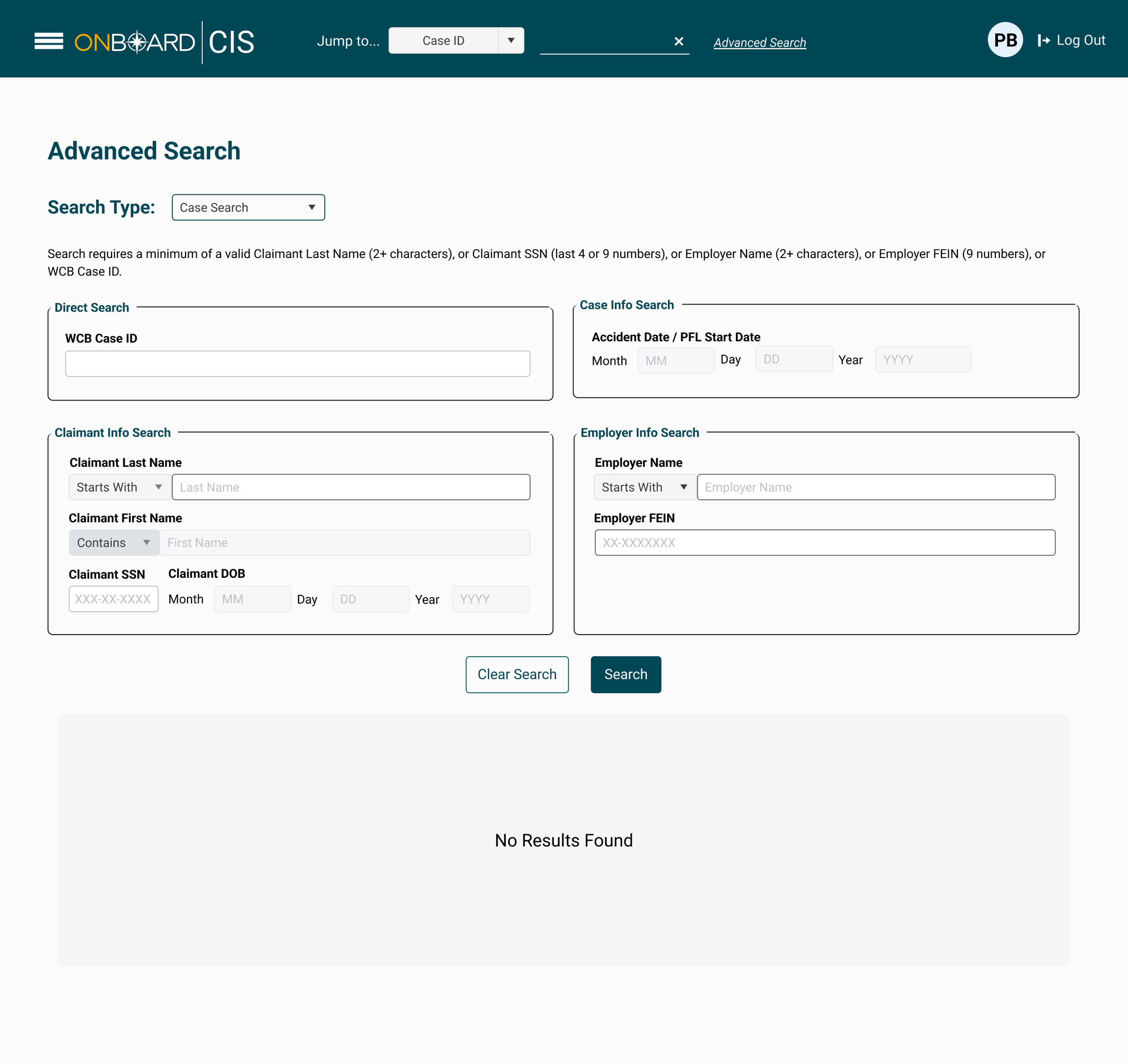
Advanced Search: Organizing Complex Search Criteria
The Advanced Search interface was designed to help users locate cases using multiple types of information—from a specific WCB Case ID to claimant, employer, and accident details.
Because users may enter the search process with different pieces of information available to them, the UI organizes criteria into distinct groups rather than presenting a single dense form. Direct Search, Claimant Information, Case Information, and Employer Information create clear entry points based on what the user already knows.
Key UI decisions
01 — Grouping Search Criteria
Related fields are contained within clearly labeled sections, allowing users to quickly identify which information is relevant to their search instead of scanning every available field.
02 — Supporting Different Search Strategies
The interface accommodates both precise searches—such as a WCB Case ID or SSN—and broader searches using names, employer information, or dates. This gives users flexibility without requiring separate search experiences.
03 — Establishing Input Hierarchy
Consistent field sizes, labels, spacing, borders, and alignment establish predictable patterns across the form. Search operators such as Starts With and Contains are visually connected to their corresponding fields so users can refine how information is matched.
04 — Communicating Search Requirements
Search requirements are surfaced before users begin entering information, helping establish what constitutes a valid search and reducing unnecessary trial and error.
05 — Clear Primary and Secondary Actions
The filled Search button establishes the primary action, while the outlined Clear Search treatment creates an appropriate secondary hierarchy.
06 — Designing the Empty State
The results area remains visually distinct from the search controls and provides clear feedback when no matching records are available. This ensures that an unsuccessful search still produces an understandable system response.
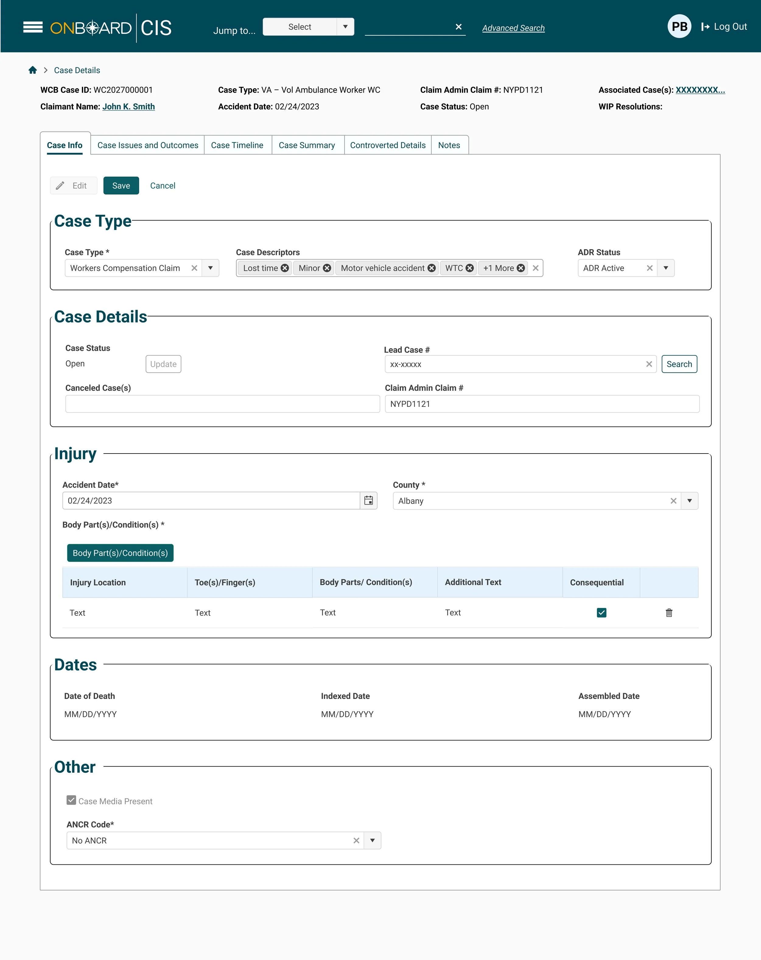
Case Details: Structuring Dense Case Information
The Case Details interface provides a centralized view for reviewing and updating critical information associated with a workers’ compensation case. Because the record contains multiple categories of information, the UI uses layered navigation and clearly defined content sections to make a data-heavy experience easier to scan and manage.
High-priority case information remains visible at the top of the page, while tabs provide access to related areas such as Case Issues and Outcomes, Timeline, Summary, Controverted Details, and Notes. Within Case Info, related data is further organized into Case Type, Case Details, Injury, Dates, and Other.
Key UI decisions
01 — Prioritizing Critical Case Information
Important identifiers and status information are surfaced above the main content, giving users immediate context before they begin reviewing or editing the record.
02 — Layered Information Hierarchy
Tabs handle the broader categories of the case, while section containers organize information within the selected area. This prevents the interface from becoming one uninterrupted collection of fields.
03 — Clear View and Edit States
Edit, Save, and Cancel actions establish the current state of the record and give users predictable controls for making and committing changes.
04 — Supporting Complex Data Types
The interface uses components appropriate to the information being managed—from multi-select case descriptors and date controls to structured injury data and status selections—while maintaining a consistent visual language.
05 — Making Related Data Scannable
Injury information is presented as structured tabular data rather than additional form fields. Column headers establish relationships between injury location, body part, additional information, and consequential status, making individual records easier to compare.
06 — Consistent Visual Patterns
Typography, spacing, borders, field treatments, section headings, and controls follow repeatable patterns throughout the interface. That consistency helps users understand the structure of the page even when the underlying information changes.